20th March 2025
Truncating a Tab, and other short stories
So you decide how your interface is going to look, and you have a good idea about how to implement it. Then you get into the detail...
It's when you start using a feature yourself that you realise that the detail of the implementation is vital to usability, and to a good working relationship with the software.
A Tabbed Interface
In a main view in my new design, I have a tabbed interface for managing content (see main pane of image below). That's pretty straightforward to implement.
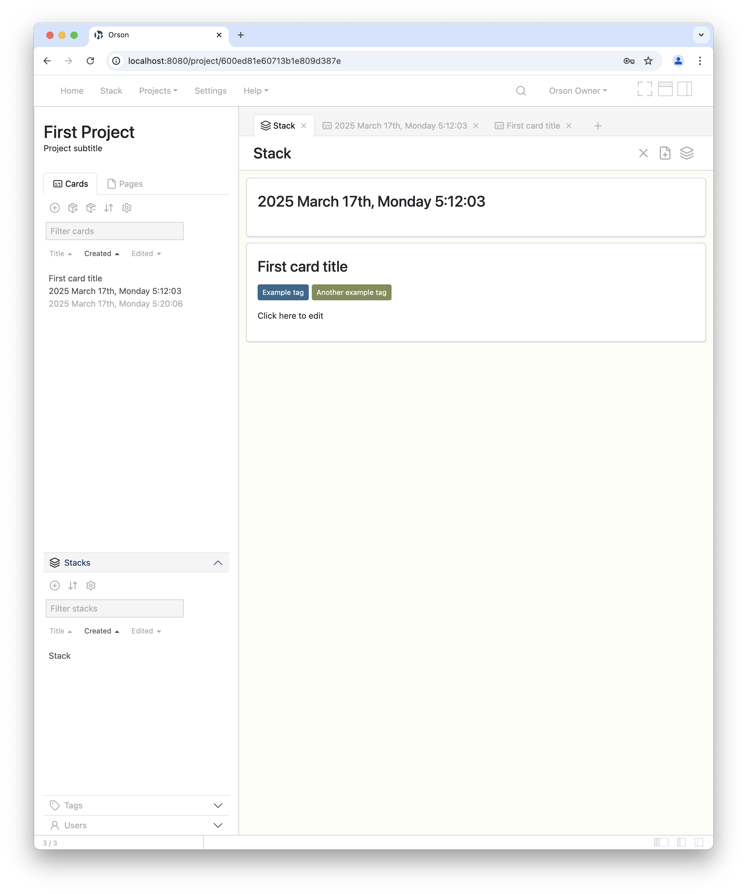
Image: Screenshot of Orsn 2 software prototype
With tabs, a tab can be as wide as the text it contains. In that case you will end up with some very wide tabs and you will be doing a lot of horizontal scrolling to be able to browse through content. So if the overall width of the tabs is wider than the browser window, it makes sense to truncate the text in the tabs, so that you can fit more into the view.
This is where it gets a bit tricky.
My Orsn tabs are not a fixed width, like those in Chrome – they are only as wide as the text in them. And do you know what, I like it like that, so I'm not going to change them to be fixed width. That means that some are narrow, some are wide, and it's not ideal to truncate every tab by the same amount. You only need to truncate the long ones when that is necessary: and when doing that, you have to take into account the extra width afforded you by narrow tabs. Otherwise, you truncate too much and your tabs don't fill all the available width of the browser, which adversely affects legibility of tab titles.
To cut a long story short, here is the logic I (eventually) arrived at for a satisfactory tab truncation process:
- Get the width of the element containing the tabs
- Get the collective width of the tabs when untruncated, taking into account buttons, padding, etc.
- If the width of the tabs exceeds that of the container:
- Calculate what the width of each tab would be if the container width was divided equally by the number of tabs
- Find any tabs which are narrower than that, and by how much. Calculate this extra width for all narrow tabs
- Add the total extra width from narrow tabs to the width of the container, then divide the total by the number of tabs
- Using the resultant widthPerTab number, for each tab, if it's wider than widthPerTab, truncate it and apply truncation styles
- Don't truncate any tab to be smaller than a minimum width
- Redraw tabs every time the page is resized
The result is something like this – here I'm resizing the browser window and the tabs are being truncated accordingly. The small tabs aren't truncated until the window becomes very narrow:
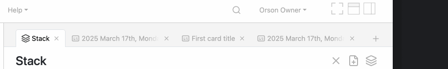
Animated image: tabs dynamically truncating as window is resized
Lessons
I find myself going through this cycle with other interface elements too, such as resizable sidebars and accordion sections, drag and drop functionality, and so on. A feature can be in a working state quite quickly, but that doesn't mean that it's satisfactory. I think this issue is only partly mitigated by using component libraries.
One's innate sense of usability in software is based on the experience of using mature software. Therefore it is sometimes more work than expected to get an interface feature to a satisfactory level of usability. It's easy to take software features for granted, and sometimes surprising to find out how much work is involved in achieving what seem to be simple ends.
One could spend a lifetime working on such features (why isn't my 'grabbing hand' cursor icon showing when I'm dragging a card? How long am I going to spend on fixing it?) and never get round to achieving 'larger' goals. There has to be a hierarchy of priorities in development, and features have to be good enough to allow progress to be made, and for the software to actually exist and achieve its goals. Beyond that point, the software can actually be put to use and then refined. Existence is all.
Contact
Find me on the fediverse (Mastodon) @Lemmy@post.lurk.org, or send an email to: info [at] orsn.io